


Start with the live badge, last update label, and short summary so you know how fresh the tournament picture is.
Overview, Progress, Groups, Matches, Bracket, and Teams each answer a different question and should be used in that order when possible.
Scroll the day rail, standings rail, and match rail to read movement quickly without drowning in a full data table.
Open the knockout architecture and source links when you need a bigger tournament-picture view or a verified external destination.

The page becomes much easier when you use it as a sequence: hero sync, overview, progress, groups, matches, bracket, then teams and sources.
1. Start with the hero because the sync status changes how you should read the page
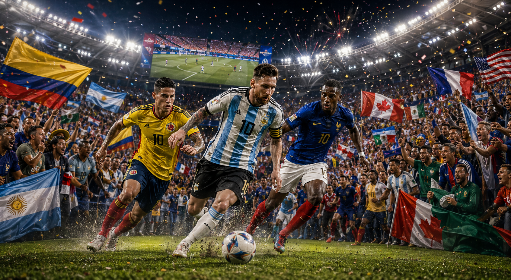
When you open World Cup Hub, the first thing to read is not the trophy graphic or the ribbons. It is the live information block in the hero. The badge, subtitle, support text, last sync label, and short summary line tell you how current the page is and what story the data is trying to tell right now. That matters because tournament pages are only useful if the viewer understands freshness. A live World Cup page should answer two questions immediately: what is happening in the competition, and how recently was that picture refreshed? The hero does both. It frames the page as a verified tournament view instead of a static article, and it tells you whether you should expect live movement, settled results, or an awaiting-sync moment. That context shapes every section beneath it. If the sync is current, the rest of the page becomes a strong operating dashboard. If the sync is stale, you still have a useful structure, but you know to read it as a recent snapshot instead of a real-time pulse.
2. Use the top tabs as a question map, not just as navigation
The tab row at the top is one of the best design choices on the page because each tab corresponds to a different kind of user question. Overview is for “Where is the tournament right now?” Progress is for “How is the event moving across days and sync cycles?” Groups is for “Who is leading and who is in danger?” Matches is for “What is live or next?” Bracket is for “How does the knockout shape look?” and Teams is for “Who is still in the field?” If you read the page with those questions in mind, the layout becomes extremely intuitive. It stops feeling like a long sports dashboard and starts feeling like a clean decision tree. Most visitors should resist the temptation to jump straight to matches every time. The strongest rhythm is hero, then tabs from left to right, because the overview and progress sections provide the context that makes later standings and fixtures easier to interpret in a more meaningful way.
3. Use Overview first to understand the tournament rhythm before you chase individual results
Open Overview and start with the stat cards. They tell you matches played, matches today, teams qualified, and the current round, which is exactly the kind of orientation most people need before they get pulled into specific teams or fixtures. Then move into the day rail. This part of the page is excellent because it compresses the tournament calendar into something you can understand visually. Each day card shows the label, how many matches are scheduled, how many are live, and how many are done. That means you can feel the tournament pulse without reading a giant schedule table. It is also one of the easiest ways to explain the competition to someone who has not been following every day. Instead of listing dates one by one, the page lets you see how density shifts across the tournament. That rhythm matters to collectors too, because matchday density affects player attention, sticker urgency, and the moments when people are most likely to jump back into album pages or trade conversations.

Overview and matchday rhythm make the page easier to read because they show how the tournament is moving before you dive into one single result.
4. Open Progress when you need the most analytical read on what is happening now
The Progress section is where the page becomes more analytical without becoming cold. The pulse panel, live tiles, sync health, next kickoff timer, and next sync timer all work together to explain the state of the event in a way that feels dynamic. If you want the sharpest operational view of the tournament, this is the section to trust. It tells you how many matches are live now, how many are happening today, how far the tournament has progressed, what the peak matchday looks like, and whether the sync cycle is healthy. That combination is useful because it answers urgency, scale, and reliability at once. A lot of tournament pages can show data, but fewer can show whether the data is moving well. This one can. The result is that the page feels alive but still organized. You can use Progress when you need to understand not only the scoreline situation, but also the pace, timing, and trust level of the broader tournament picture.
5. Use Groups and Matches together because standings only matter when you can tie them to fixtures
After Progress, move through Groups and Matches as one pair. The group rail shows the table race clearly, with team names, points, positions, and flags, which is perfect for a fast read on who is leading and who is under pressure. The match rail then completes that picture by showing the live and upcoming fixtures with status badges, scorelines, stadiums, cities, and direct FIFA Match Centre links when available. That pairing is important because standings without fixtures feel abstract, and fixtures without standings can feel disconnected from consequence. When you read them together, the page explains both tension and schedule. This is one of the strongest step-by-step habits for visitors: read the group you care about, then immediately scan the match cards that can change that group. It is a much cleaner way to follow the World Cup, and it also gives collectors stronger context for which teams and players are likely to become more emotionally relevant on the same day.

Bracket and phase visuals help visitors understand where the tournament sits in the wider journey, not only inside one isolated match night.
6. Use the Bracket popup when you need a bigger knockout picture without losing the main page
The Bracket section solves a very common problem in tournament interfaces: knockout architecture is important, but it can easily make the page feel overcrowded. Here the page handles that by keeping the main view compact and giving you the Launch Architecture Popup button when you want the full tree. That is the right move. The summary cards keep the stage counts visible, but the modal lets you study the knockout lanes without destroying the flow of the rest of the page. Once you finish there, move into Teams, where the group chips provide a quick visual roster of the field that is still active or already qualified. Those two sections complement each other well: bracket for structure, teams for the human roster layer. Together they make the page feel complete. You can read tournament shape, remaining paths, and active nations without being forced into a giant spreadsheet or a cluttered full-screen board from the first minute.
7. Finish with sources, then hand the moment into Live Hub or Album Collector depending on your goal
The last smart move on the page is to treat it like a verified decision point, not the end of the journey. The trust cards and official source links at the bottom reinforce that this is a curated live product surface, not a loose rumor feed. Once you know where the tournament stands, the next page depends on what you want to do. If you want city atmosphere, matchday movement, and host-city context, continue into Live Hub. If the tournament moment is pushing you back toward collecting, move into Album Collector and update progress, missing stickers, or trade activity while the emotion is still fresh. That is what makes World Cup Hub so useful. It is not trying to do everything alone. It is giving you the tournament picture in the right order, then sending you into the next practical page with much better clarity. Used that way, it becomes a real operating layer for the whole site rather than just another sports page sitting beside the product.